The University of Maryland’s School of Nursing magazine focuses on people – those they educate and those they help. We gave the publication a modern, humanistic look that accurately represents today’s nurses in the field, with an eye toward an open, accessible content structure and layout.
Setting the Tone
To lay the groundwork for the new look of the University of Maryland’s School of Nursing magazine, we first focused on the nameplate. By reconfiguring and refining the existing title, “NURSING FOR/UM,” we brought increased clarity and a contemporary approach to the typographic design, further emphasizing the play on words. Combining the updated nameplate with dramatic portraiture for the inaugural issue (a four panel fold-out cover), we created an arresting contrast to previous issues and laid the groundwork for a focus on people inside the magazine.
The First Impression
An organized, user-friendly table of contents introduces the new editorial voice and improved structure of the magazine. The clean, legible design of the contents page juxtaposed with high-impact photography (inside cover) makes it clear that the reader is in for a new, reinvigorated editorial experience.
“Our team has been involved in magazine production for years, and I can’t recall a production process—let alone a redesign—that has gone more smoothly. Not once did my blood pressure soar, and that’s thanks in large part to the Skelton team’s calm, careful project management.”
Giordana Segneri
Director of Public Relations and Marketing
University of Maryland School of Nursing
The Features
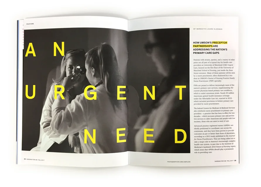
To capture the unique voice of NURSING FOR/UM through the feature section, we created a visual language that echos and enhances the stories. Packaged with a combination of smart writing and dynamic photography, the feature stories reinforce the professionalism, success, and engagement between the School of Nursing and the community. A combination of strong photography, clear typographic hierarchy, and purposeful use of white space creates layouts that draw the reader in.
The Departments
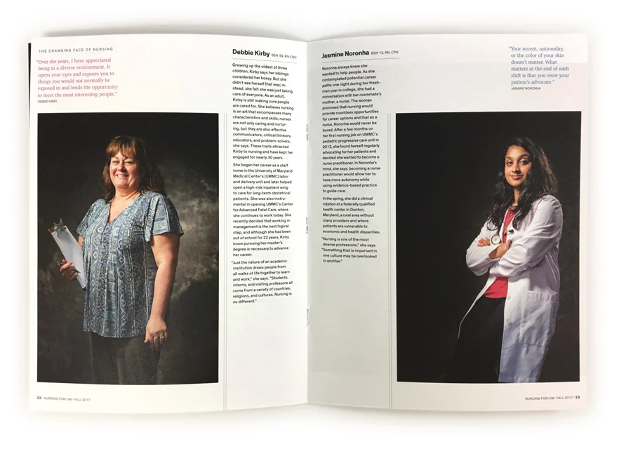
Simple, clean departmental layouts are designed to appeal to specific groups and to discuss recurring topics of interest, such as current research, demographics, events, and statistics. A friendly, bright color palette, along with custom photos and spot illustrations, enhances the readers’ experience.
“Claude, Elizabeth, and Kevin understood our publication’s challenges immediately and developed a product that transformed those negatives into a visually stunning, easy-to-read, well organized, and intentionally designed publication of which we are so very, very proud. The issue dropped a couple of days ago, and the positive feedback is already rolling in. We’re looking forward to watching the magazine’s new identity blossom over future issues.”
Giordana Segneri
Director of Public Relations and Marketing
University of Maryland School of Nursing


