Ten years ago we did a complete identity redesign for Baltimore Clayworks, so we were excited to get a call back to refresh the brand in 2018. The outcome of the work was a new master logo, program logos, a style guide and brand assets for their communications team, including new stationery.
Program Logos
Working in partnership with the new website architecture, we developed a series of program icons to emphasize areas of organizational focus.
Color Palette and Typography
A bright, contemporary color palette and friendly, highly legible, typeface were introduced.
Graphic Assets
A library of graphic assets including icons, photographic textures and artist marks allow Clayworks staff to implement future communications, collateral and merchandise.
“Working with Skelton Sprouls on a refresh of our logo was a pleasure, and their insight was invaluable. They took the time to help us carefully think through our needs and came up with a design that preserves our identity as it modernizes our brand. The logo, together with the style guide they created, have become the framework for our marketing push across all platforms.”
Carla Dunlap
Board Member and Communications Committee Chair for Baltimore Clayworks
Stationery
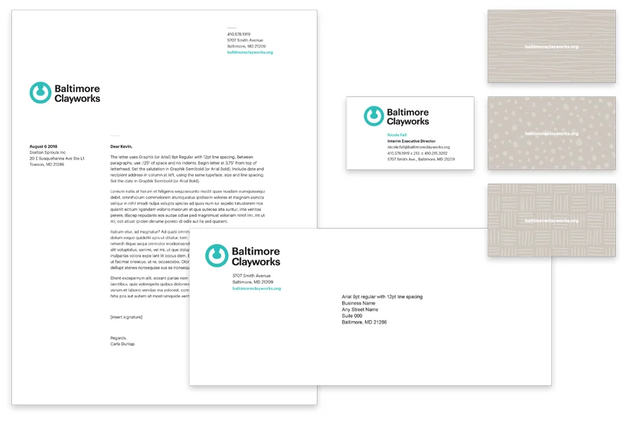
The letterhead, envelope and business cards give Clayworks a fresh, contemporary face.
Collateral
Various print collateral, such as posters and postcards, implement the new brand.
Merchandise
Brand colors and artist marks liven up Claywork’s merchandise.


