
McDaniel College: Yield Brochure
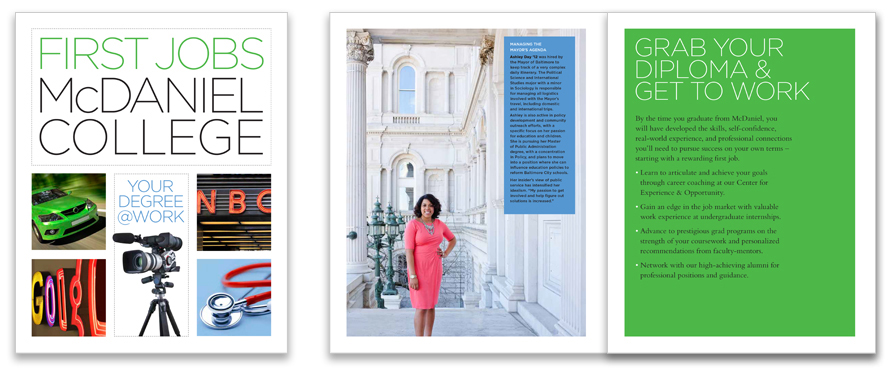
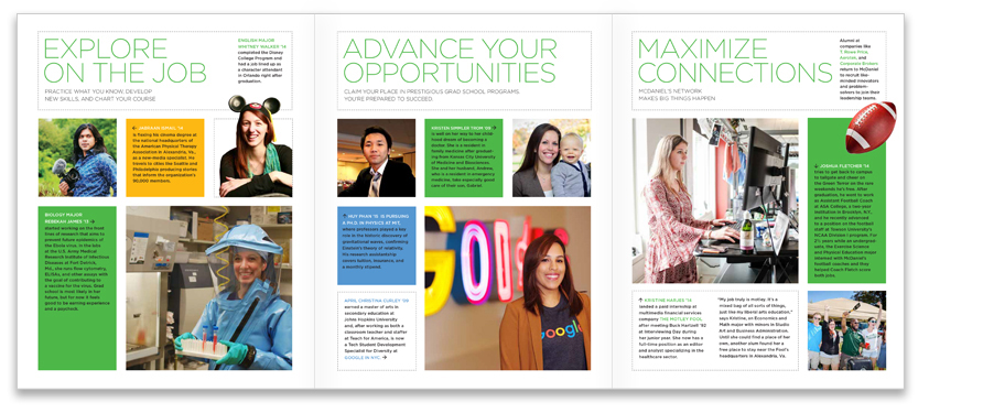
McDaniel College’s yield brochure is all about developing real-world experience and professional connections to gain an edge in the job market after graduation. Featuring recent alums in first jobs such as an assistant producer of PBS’s “Motorweek” and a personal assistant to the Mayor of Baltimore, the piece demonstrates how a liberal arts degree can translate to a myriad of career choices.
Jessica Kartalija Media

Jessica Kartalija, WJZ-TV reporter and news anchor, is starting her own strategic communications company. She sought us out to design and create the identity and business cards for Jessica Kartalija Media.

The goal is not to cram as much as possible onto a page. The goal is to communicate a message. It's not a sin to use white space.
York College of Pennsylvania


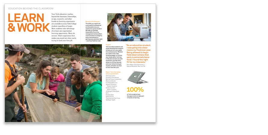
"Get Set," mailed to students admitted to York College, is another component of this year's admissions stream. The piece shows the many ways York can prepare undergraduates for a career while working toward a degree.
Barnes Foundation Educational Materials

In our continuation with the Barnes Foundation Educational Department, we’re adding to their school program materials. We designed four new classroom posters and a new section to the curricular binders we originally created.
Look! Reflect! Connect!: Art Exploration for Young Children is a PNC Grow Up Great initiative for underserved children in pre-kindergarten and their teachers that provides pathways for developing personal relationships with art. The program, implemented in 2014, uses in-class learning for children led by Barnes educators.


Effective pacing creates reader-friendly magazines, allowing readers to choose entry points when scanning a publication. Visual and editorial pacing keeps a magazine lively and engaging. Just as editorial content contrasts short news items with longer feature stories, good design juxtaposes contrasting images, typography, and colors.
Art Books: Creating a Keepsake

Museums often create books that serve as an overview of their collection, or of a particular aspect of the institution, that can be sold to visitors as a recollection of their experience. Compressing selections from an entire museum’s collection into 128 pages or less requires a critical level of editing…
