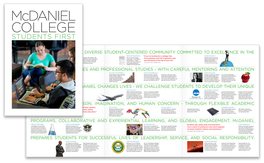
McDaniel College’s student-centered philosophy is reflected in their latest admissions brochure “Students First,” with their mission statement and recent examples of the mission in action displayed across three panels.

Good visual contrast and typographic hierarchy capture a reader’s attention.
Contrast creates emphasis by making a word or phrase distinguishable from other words or from the background. Dueling fonts can heighten contrast and enhance meaning.
Typographic hierarchy establishes different, or parallel, levels of importance through size, weight, color, or style.
Johns Hopkins Breakthrough Magazine

"Pulchritudinous!" was the response from Johns Hopkins to the holiday 2015 issue of Breakthrough magazine. We think it looks beautiful too, and the feature story about Lyme disease and the evil deer tick are quite compelling. Other stories include treating cancer with the immune system and suppressing inflammation to prevent frailty as you age.
Issues are also available to read on the new CIM website.
St. David’s School, Admissions & Development Brochure
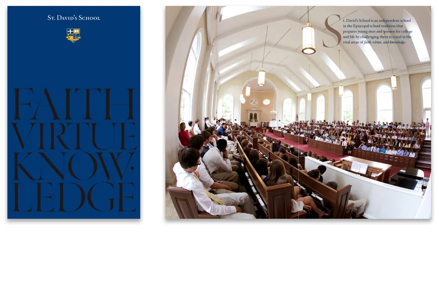


St. David’s School, an independent Episcopal school in Raleigh, NC, wanted an elegant, all-purpose publication to highlight their “vision and value” to prospective students, parents and potential donors. We worked closely with a marketing consultant and the school’s headmaster to create a visually comprehensive and concisely written brochure that shows how St. David’s practices what they preach – through faith, virtue, and knowledge. Those three words were emphasized on the cover with high-gloss spot varnish.
York College of Pennsylvania
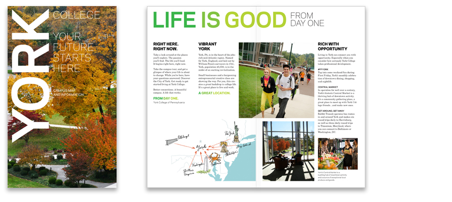
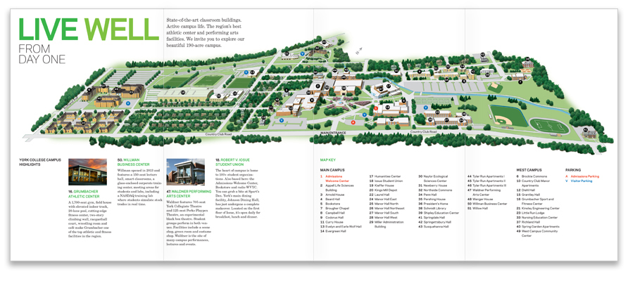
In our continuation of York College’s new admissions marketing campaign, we recently completed the Visit piece, a brochure encouraging prospective students and their parents to visit the college. A large campus map is included in the 4-panel fold-out, as well as smaller regional map, illustrated by Eric Hanson.

Design brings branding strategy to life.
Without graphic interpretation, a brand is just words. Ideally, the strategic and creative processes are collaborative. Many times the strategy informs the design direction. But often a creative design solution or graphic experiment can alter the direction of a marketing strategy and take it into unexplored territory. That’s what makes our clients stand out from the crowd.
St. Mary’s College of Maryland, Mulberry Tree Magazine
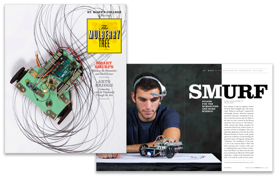
Joe Cirillo ’17, a computer science major at St. Mary’s, built a robotic device controlled by neurological activity – “using a machine to produce art.” Naturally, we featured the robot on the fall 2015 cover of The Mulberry Tree. Cirillo is one St. Mary’s Undergraduate Research Fellow (SMURF) profiled in the story about a project-oriented program that combines the humanities with hard science.

Effective communications require good words and good images that work together to tell a story.
Put another way, it's not enough to give a designer a pile of words and say, "Here, makes these look good." A photographer needs better direction than "Go shoot some good pictures and be sure to get fall leaves." Remember, ideas before ink.
St. John’s College Alumni Magazine
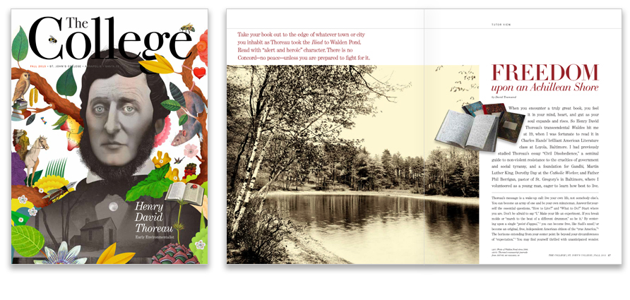
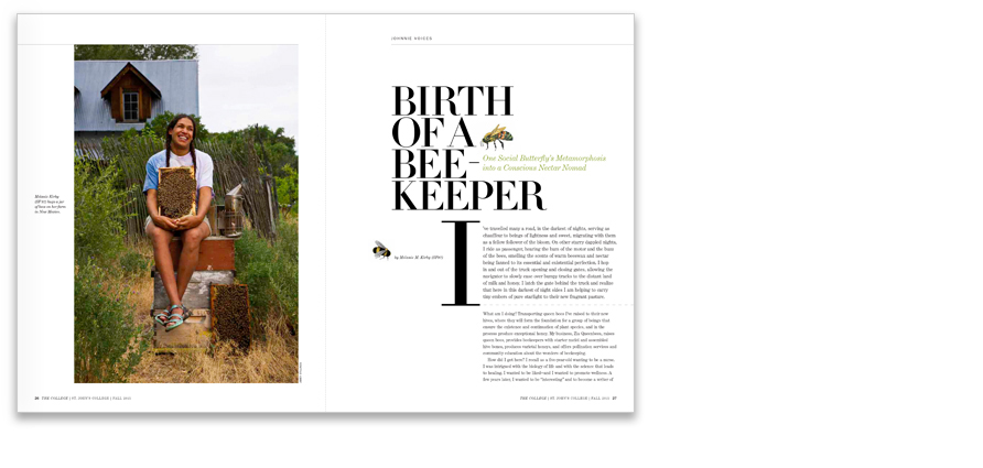
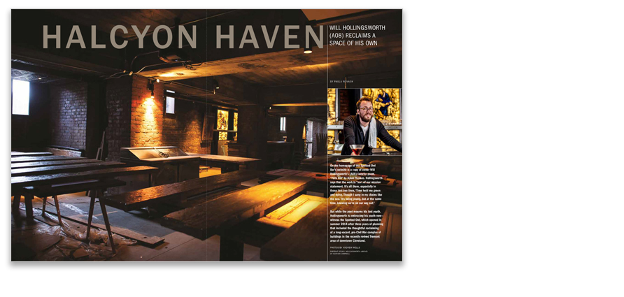
For the fall issue of The College, St. John's College’s alumni magazine, we introduced new typefaces and more space for large photography, streamlined the template, and made overall structural improvements throughout the magazine. The cover story, an essay on Henry David Thoreau’s Walden and how its message still resonates, features a whimsical cover illustration by Brett Ryder. Two alumni continue the theme of self-sufficiency: a beekeeper concerned with sustaining the planet's plant species, and a barkeeper who transformed an abandoned historic building into a neighborhood pub.
Changing Business

The Fall 2015 issue of Changing Business for Johns Hopkins Carey Business School features a cover essay on how workers in various fields can learn from the strategies of wildfire fighters to perform well in unpredictable circumstances. Additional articles include Twitter’s relation to IPO’s, online reward programs, and how people view the sale of human organs. Illustrations in this issue are by Edmon de Haro.