We were introduced to York College of Pennsylvania in 2015 when we designed their admissions publications and coordinated on-campus photography. The York editorial team took notice and commissioned a magazine redesign with the intention of responding to a reader’s survey, giving the magazine a visual identity that better reflects the college’s brand guidelines, and celebrating their 50th anniversary.
Cover and Features
For the redesigned cover, we commissioned photographer Chris Myers to shoot a portrait of professor Craig Bauer, a cryptology expert and math professor. We suggested dramatic lighting against a background of mathematical codes and ciphers to suggest mystery. Myers incorporated a combination of projecting and superimposing numbers in post-production to come up with the innovative cover photo (at top) and the story’s opening shot (above). Our objective for the design of feature stories is to create a strong visual impact, with compelling large images, big, bold headline type and white space – all to clearly distinguish the feature well from news and alumni sections.
Filmmaker and York alum David Larson supplied this “on set” photo for his feature profile. Bold typography keeps the opening spread consistent with the magazine’s overall look.
“In Focus,” a recurring feature of the magazine, is a double-page page photo with caption that highlights an aspect of the York College program. The spread serves as “eye candy” for readers, with strong visual appeal and high strategic value.
Our objective for the design of feature stories is to create a strong visual impact, with compelling large images, big, bold headline type and white space – all to clearly distinguish the feature well from news and alumni sections.
Table of Contents and Departments
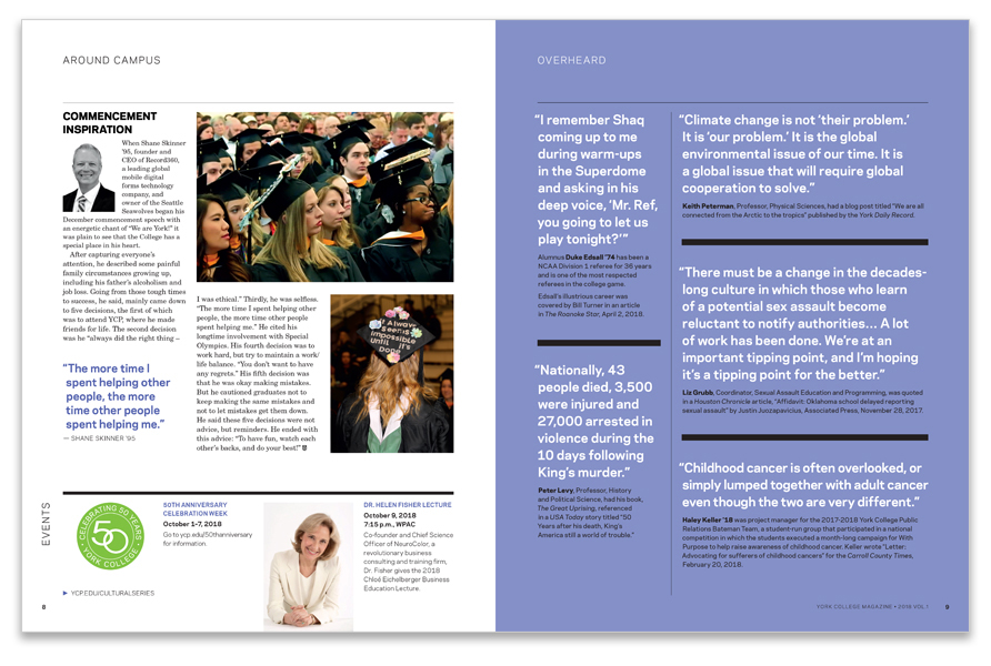
The contents page clearly captures the editorial hierarchy of the issue and sets the reader up for easy navigation. The inside cover photo is an outtake from one of the feature stories, in this case, filmmaker David Larson in his studio. New recurring sections have been introduced, such as: “Overheard,” a compilation of quotes and excerpts from published articles by faculty, alums and students; “Pursuits,” brief stories on faculty research reflecting the spirit of innovation at York (spots by Tim Boelaars); and “Hands-On,” a column aimed at spotlighting faculty who forge professional connections for students through programs, coursework, internships, etc.
“I applaud your efforts on the new design format. It's modern, sleek, easy to read... and it's pretty! (And who doesn't like pretty things?) Excellent work.”
Jessie Kresge Heimann ’01


