We were asked to undertake a comprehensive redesign of the alumni magazine for the University of Notre Dame’s Mendoza College of Business. For us, the process started with conversations between our staff and theirs.
Along with the Mendoza editorial team, we spoke with the dean, Mendoza faculty, staff, students, and alumni. Through focus groups and a readership survey we learned two important things. One, Mendoza alumni overwhelmingly responded to stories of people – personal stories of people doing amazing things, thinking about the challenges facing humanity, or leaning on their faith to overcome tragedy. The second thing we learned is that more than a few alums had never heard of Mendoza Business. We had our work cut out for us.
First Impression
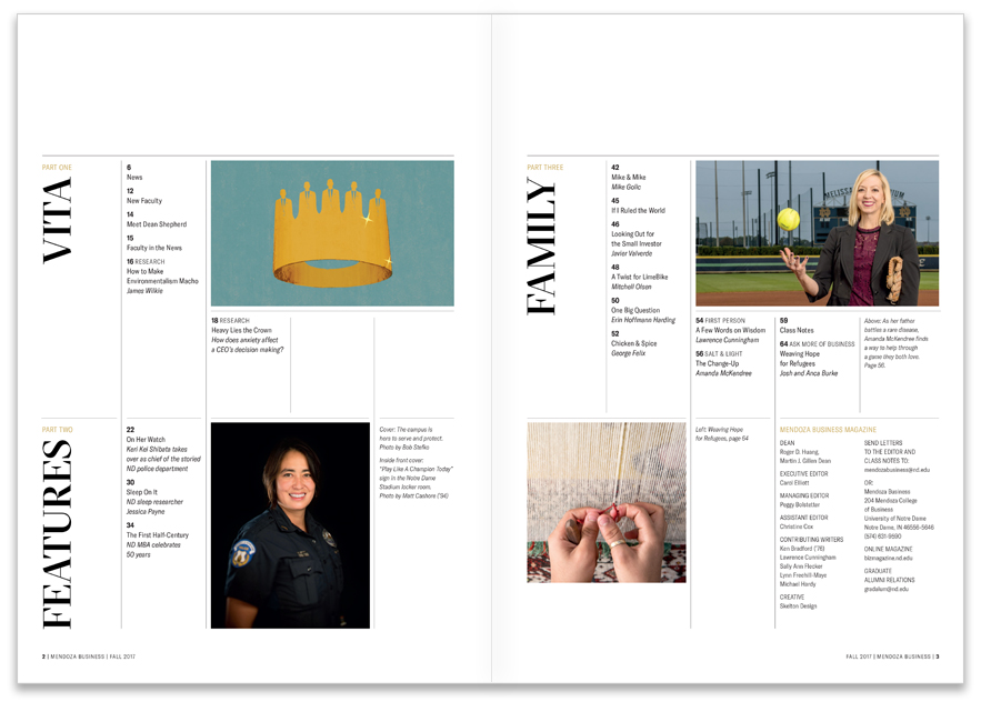
The new table of contents signals a re-organized publication, with special attention to ease of navigation through the issue. The magazine’s content is now divided into three distinct sections: news and faculty research (Vita); feature stories (Features); and alumni profiles, opinions and class notes (Family).
The magazine introduces a serif display typeface that stylistically combines Notre Dame tradition with a contemporary sharpness. The typography, along with a consistent, flexible grid and intentional use of white space, gives the publication a clean, modern sophistication.
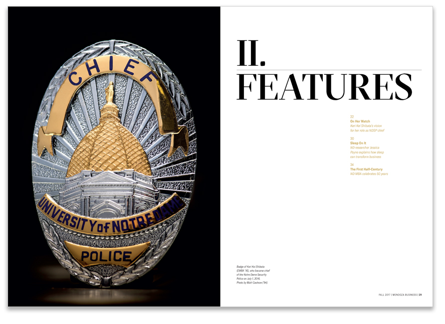
The three section dividers reiterate the table of contents, each showcasing a full page photo related to that section.
“The redesign was also a good time to rethink our entire approach, from the best way to reach our audience to our workflow. Skelton Design was instrumental in guiding this process, which resulted in a beautiful design that was fresh and innovative, yet remained true to our core identity.”
Carol Elliott
Executive Editor
Mendoza Business Magazine
University of Notre Dame
Vita
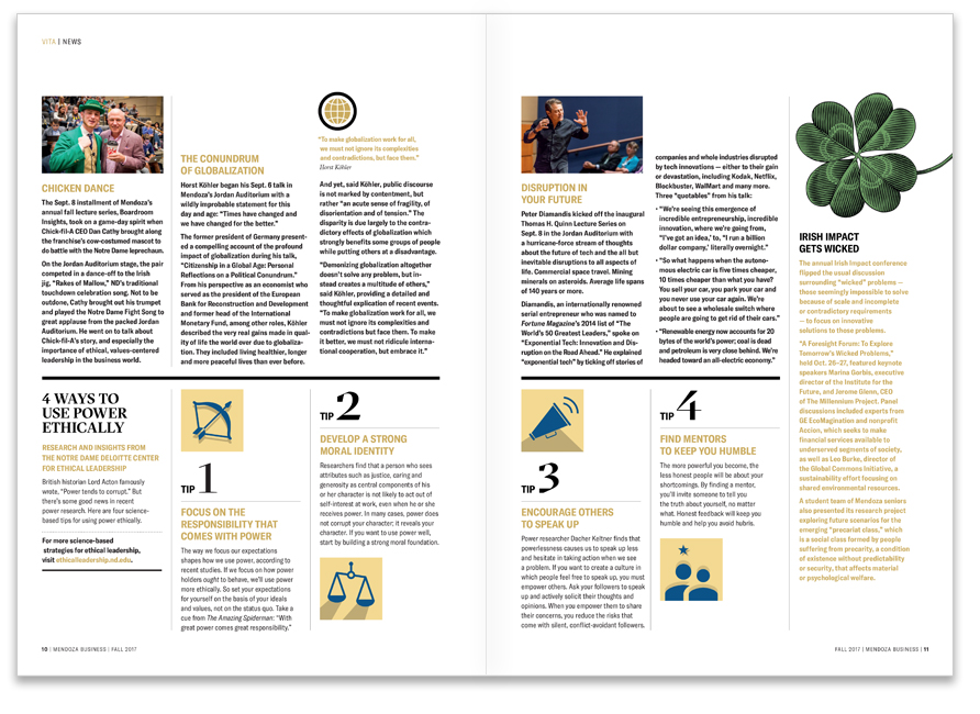
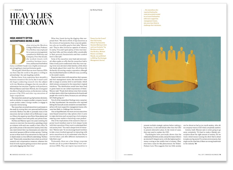
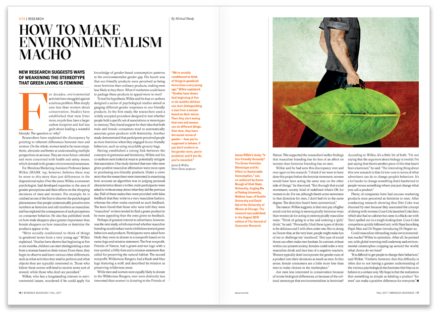
The front of the book is devoted to short pieces on student activities, faculty news, campus events, and current research by Mendoza faculty. The design of these pages introduces a built-in hierarchy and color palette that allows for variety, and multiple entry points (call-outs, quotes, captions) to facilitate a quick read. Concept-driven illustration is used to depict research topics.
Features
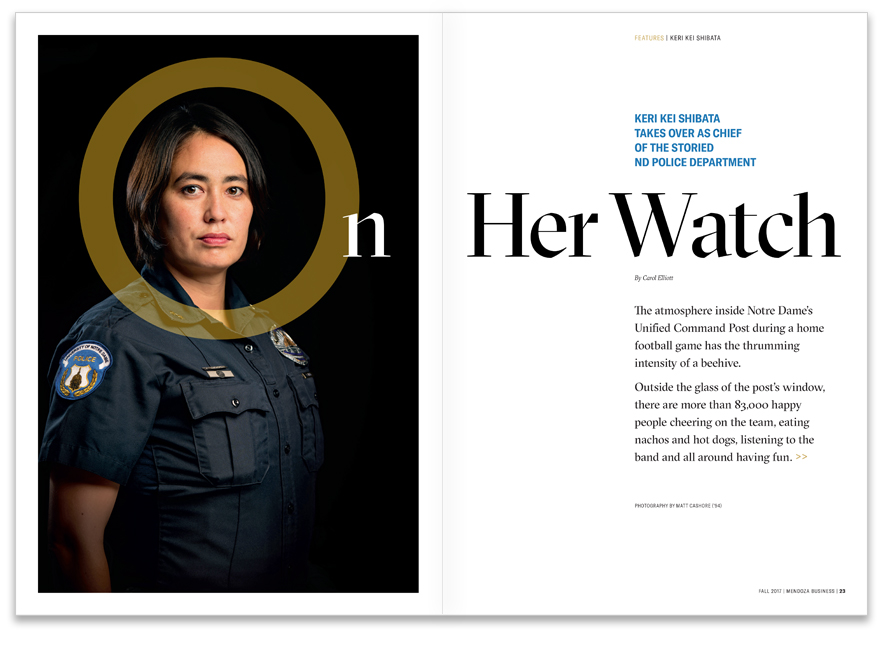
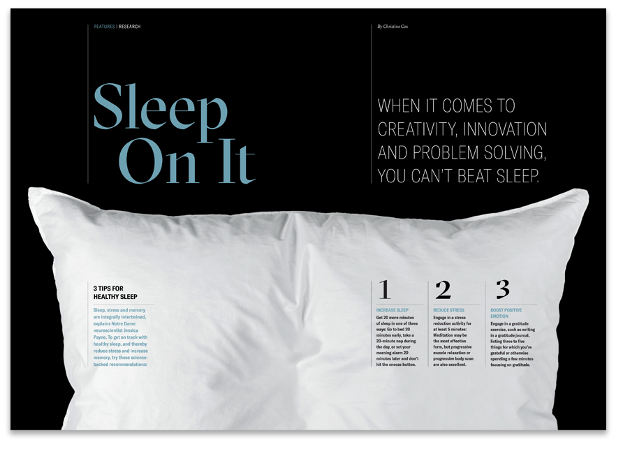
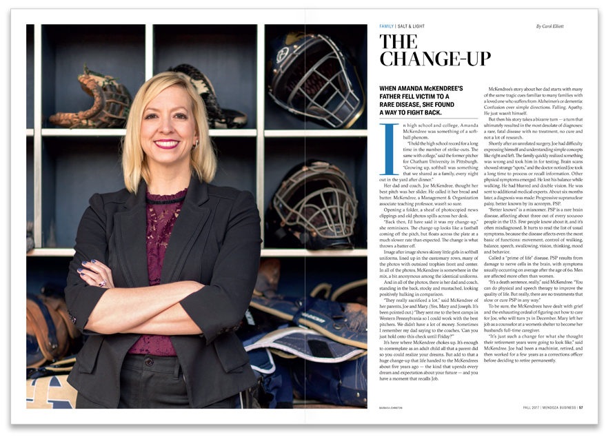
Early in the redesign process, we made a decision to incorporate photography to illustrate stories of people. The cover story, about Keri Kei Shibata, a Mendoza alum who recently became the first female chief of the Notre Dame police department, juxtaposes portraits with candid shots of Shibata performing her duties on campus. A story on a Notre Dame neuroscientist who specializes in sleep, stress and memory, describes how promoting a sleep-friendly business culture will create better leaders, greater ideas, and happier, more productive employees. Rather than featuring a portrait of the professor, we chose instead to lead with a photo that is representative of her work.
Family
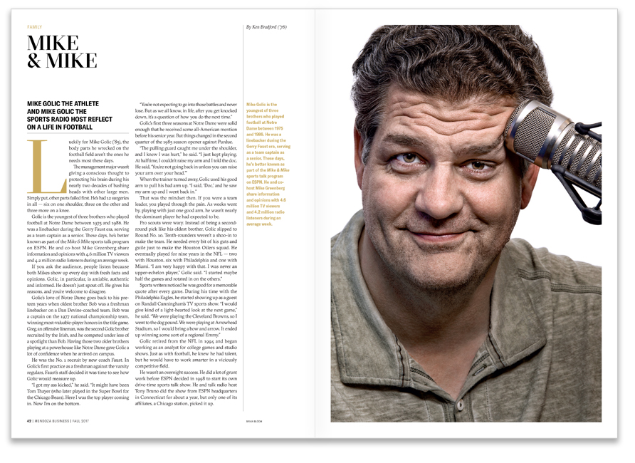
For the alumni section of the magazine, we created a consistent template for profiles and incorporated varied styles of portraiture and illustration to create variety. Working in varied professions all over the world, alumni values and intelligence shine through in their stories. The Mendoza motto, Ask More of Business, comes up time and again through their concern for the greater good, not just for the bottom line. From a successful sports radio personality, to the creator of a financial advice site that helps small investors, to a softball-playing professor who spearheaded an event to raise funds for her father’s debilitating disease, these Mendoza graduates have built their careers while adhering to ethical principles learned at their alma mater.
Dean's Report
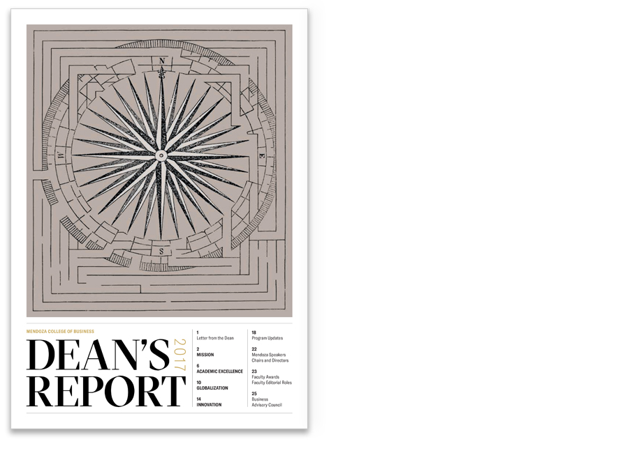
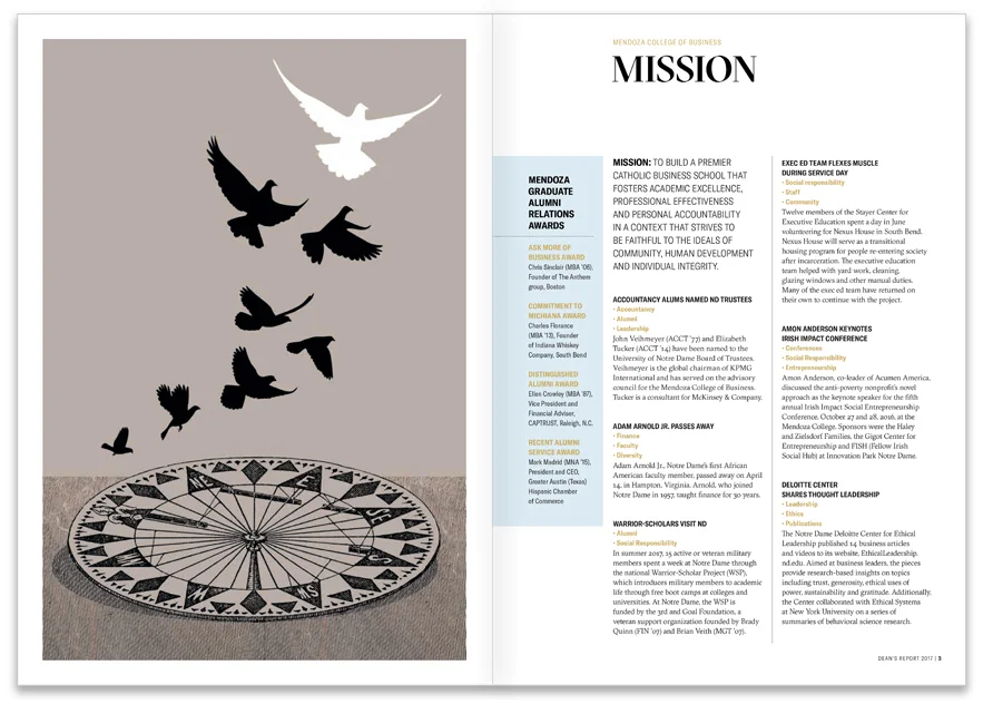
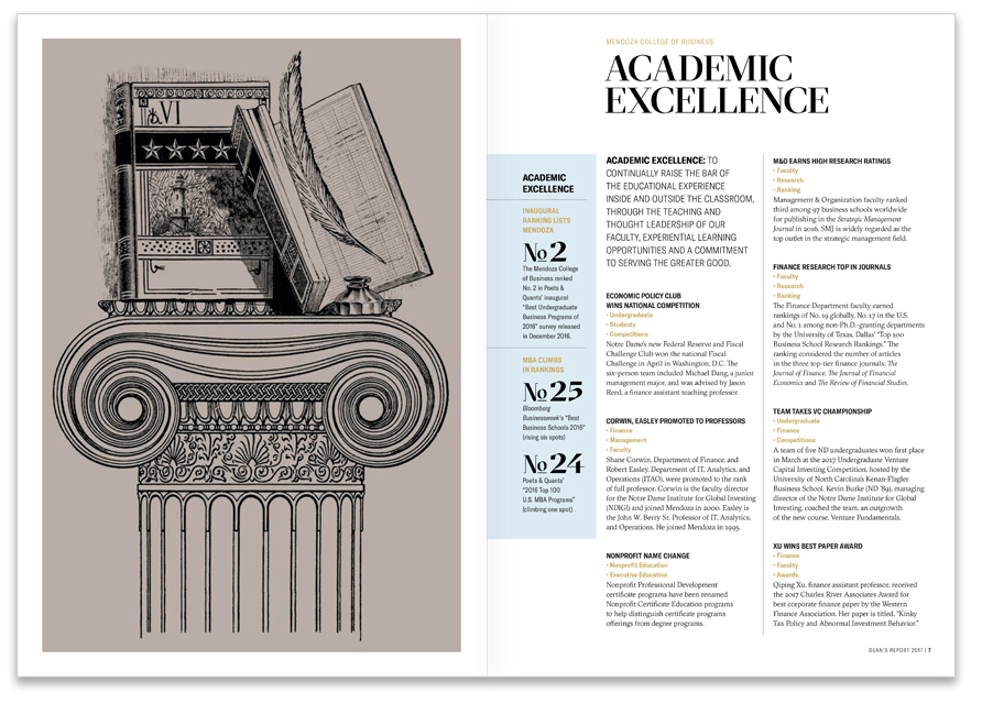
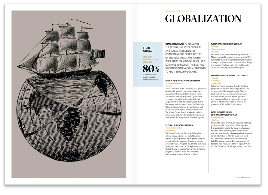
The aesthetic of the magazine was incorporated into the annual Dean’s Report, which was mailed along with the magazine. The report is divided into the four major pillars of Mendoza College of Business, each anchored with a full page illustration. The cover and section illustrations are by Leigh Guldig.
