
New Jersey Institute of Technology is a public research university. At NJIT, a distinguished faculty introduces students to cutting edge research in labs devoted to the advancement of applied science and technology. From breakthroughs in biofuels to bold new solutions in engineering, architecture, and computing science, NJIT is an undisputed leader. Researchers work constantly to develop technologies that meet the challenges of critical global issues: fighting epidemics, recycling non-biodegradable plastics, discovering technological solutions for global water shortages – the list goes on.
By juxtaposing photography and graphics, the illustrator created a dramatic, eye-catching image that speaks directly to the topic while leaving specifics to the reader’s imagination.
Since 2008, Skelton Sprouls has partnered with NJIT to produce an alumni magazine aimed at maintaining strong relationships with its graduates. Each dynamic cover featured a noteworthy area of ongoing research while still maintaining a recognizable and consistent visual identity (see below). This year, the editors asked us to reconsider the overall design of the magazine to update the look, refresh the cover design, and punctuate issues with more large photography. On the cover, with the NJIT logo maintaining its top right position, we introduced full-bleed imagery and updated typefaces. For this issue’s timely feature on combating the ebola and chikungunya epidemics, we called on illustrator Javier Jaén to bring a conceptual dimension to the cover with his distinctive editorial style. By juxtaposing photography and graphics, he created a dramatic, eye-catching image that speaks directly to the topic while leaving specifics to the reader’s imagination.

A preliminary cover concept (above) shows a mosquito killed by a location map symbol indicating the use of electronic communication to help eradicate epidemics. (NJIT opted not to use this cover since not all diseases in the research are mosquito-borne.)

Four covers prior to the redesign: Fall 2014 (Illustrator: Mark Smith), Spring 2014 (Illustrator: Lamosca), Fall 2013 (Daniel Pyne, GettyImages), and Spring 2013 (Illustrator: John Dismukes)
Inside spreads have taken on a fresher, more contemporary appearance through the use of a family of sans serif typefaces in multiple weights, bold applications of color, and an increased emphasis on strong photography.
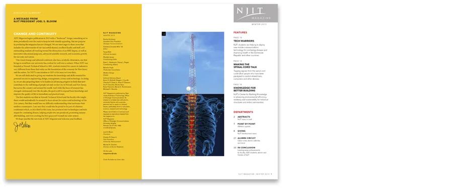
President’s opening letter and table of contents.

ABSTRACTS, the up-front news section of the magazine.


Three feature spreads showing variations of the new design approach.
Read other case studies from our Editorial series:
• Magazines: First Impressions
• Magazines: Making Covers Memorable
• Editorial Case Study No.1: St. John’s College, The College Magazine
• Editorial Case Study No.3: Messiah College, The Bridge Magazine
• Editorial Case Study No.4: Johns Hopkins Carey Business School, ONE Magazine
• Editorial Case Study No.5: St. Mary's College of Maryland, Mulberry Tree Magazine
Want to be notified when additional case studies in this series are posted?
Subscribe here to receive emails from us.