A publication’s first pages (including the inside front cover!) are critical real estate. They establish visual style and editorial voice. Make them as compelling as possible with great photography and well-organized, concise contents that make readers want to keep reading.
Create Breathing Room
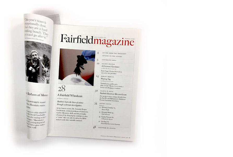
A big, unexpected “campus life” scene dominates this opening spread, followed by a double-page table of contents. Fairfield University’s magazine allows a large photo detail and a short synopsis for each of its three feature stories.
Feature Online Exclusive Content
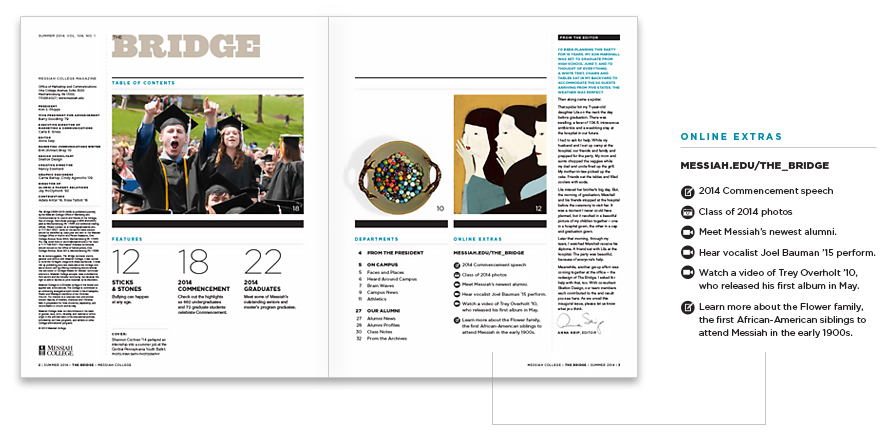
Devoting space on the contents spread to the magazine’s digital counterpart is a good way to direct readers to your website. Messiah College’s magazine, The Bridge, devotes a column to online extras and introduces icons for photos, videos, and additional text.
Opening images to the magazine don’t necessarily need to be tied to feature stories – but they do need to be intriguing and visually arresting.
Flip It On Its Head
These covers (top row) incorporate conceptual images and editorial teasers that reflect varied research and curricula in science and technology at NJIT. To contrast with the lively, informational covers, the contents pages (bottom row) are full-page images with a straightforward contents list.
Leading With Artwork
A full-page conceptual photo on the inside front cover interprets a recurring department, “By the Numbers,” in Johns Hopkins Carey Business School’s magazine. Opening images to the magazine don’t necessarily need to be tied to feature stories – but they do need to be intriguing and visually arresting.
Read earlier case studies from our Magazine series:
• Magazines: Making Covers Memorable
• Magazines: Designing a Feature Story
• Magazines: Recurring Themes
Want to be notified when additional case studies in this series are posted?
Subscribe here to receive emails from us.


