What is the elusive thing that makes a magazine cover both memorable and beautiful? For college and university magazines, covers can be especially difficult to pull off because subject matter varies widely. This challenge makes for a uniquely creative opportunity, yet many alumni magazines miss the chance to stand out from the crowd. How to find that magic balance necessary for a great cover? Here are three ideas.
Illustrating People
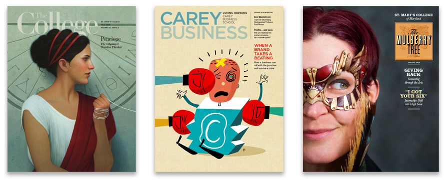
The cover of St. John’s College’s alumni magazine, The College, depicts authors or characters from classic literature, befitting SJC’s “Great Books Program.” We suggested this concept when the magazine launched in 2000, and a few years ago added conceptual tweaks to the illustrations relating to themes that appear in the issue. For example, the Fall 2016 cover features Penelope, wife of Odysseus, in Homer’s Odyssey. Penelope embodies this issue’s theme, creative thinking, a characteristic she shares with graduates of St. John’s.
As the story goes, while Odysseus was off fighting the Trojan War, Penelope wove, unraveled, and re-wove a shroud in order to stall her suitors while remaining faithful to her husband. She proved to be “a person who is effective in facing her world and its problems by thinking her way out of them,” according to St. John’s tutor Michael Grenke.
We commissioned illustrator Thomas Ehretsmann to show Penelope as both a mythical figure and a realistic woman. We supplied Ehretsmann with resource images of Penelope and suggested some ideas symbolizing the passage of time such as a full moon or a sundial. He submitted sketches of various poses before we asked him to incorporate an ancient Greek sundial image as a subtle background.
Working from a live model, the artist shows Penelope clutching the thread from her weaving and posed in front of a Greek sundial.
Illustrating Concepts
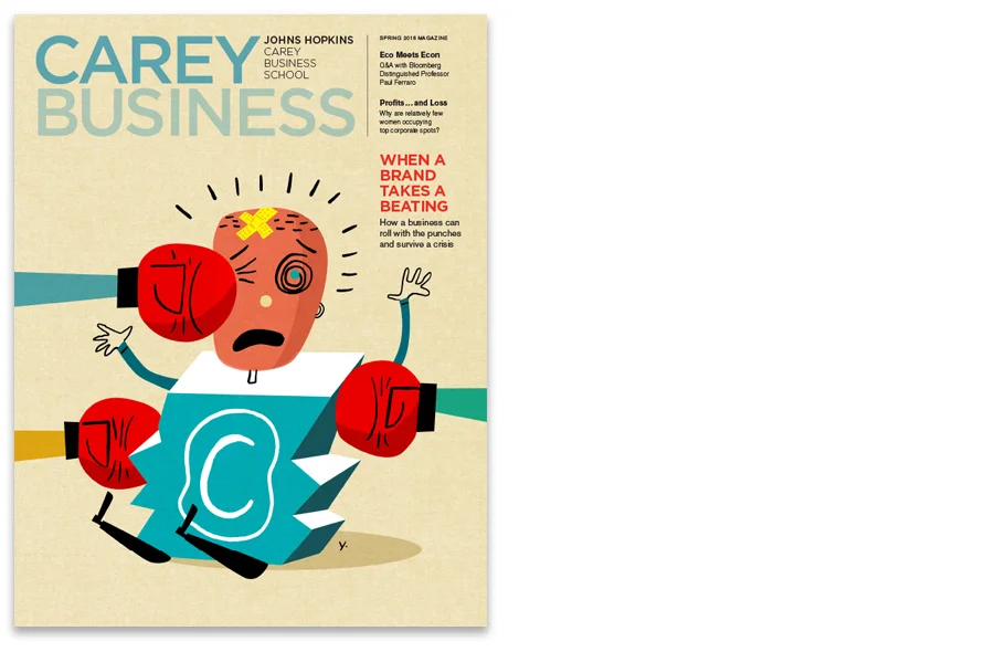
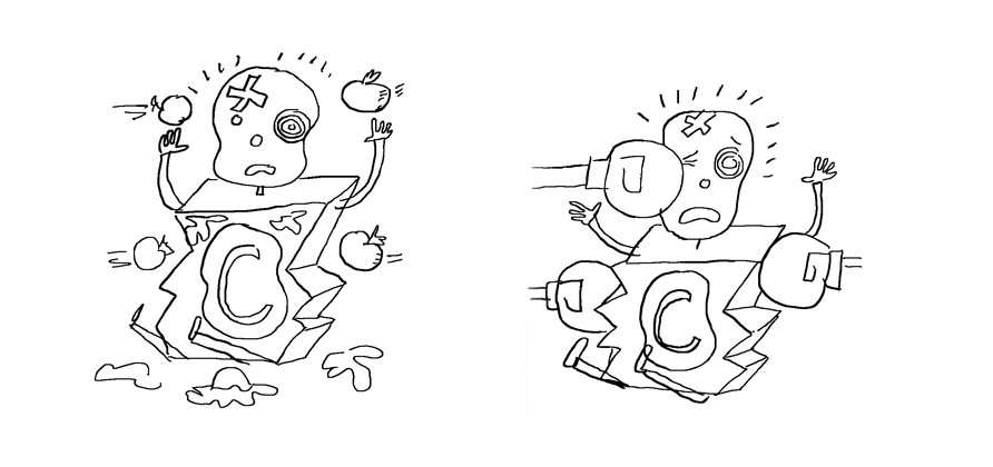
The Johns Hopkins business school’s alumni magazine features concept-driven covers based on faculty research and innovative programs – usually serious, thought provoking topics. For a Carey Business story on managing crises, such as a damaged reputation resulting in a tainted brand, we we wanted to inject some humor. We asked illustrator James Yang to take a copyright symbol and “damage it” in a whimsical way. He came up with “Copyright Man” getting bombarded with tomatoes, punched with boxing gloves, and broken apart. Although we loved them all, we decided the boxing metaphor worked well with the headline and made a memorable cover.
Before and after sketches
The inside spread shows “copyright-man” being cleaned up and polished, his reputation restored.
Art Directing Photography
Devoted alums of St. Mary’s College of Maryland often come back to campus to mentor students. Some who have made careers in the arts – such as Jolene Schafer, who started a company that makes handmade masks – return as artists-in-residence for a semester. To stay within budget, we art directed St. Mary’s photographer from our studio by showing mock-ups using stock images inspired by shots from the company’s website. The resulting cover portrait of Ms. Shafer is above.
When budget doesn't allow for travel and on-site art direction, we often create mock-up covers with found or pieced-together images to give the photographer a sense of concept and composition. For this cover, a photo from Jolene Shafer’s website (below right) gave us the idea to shoot a simple portrait of her wearing one of her masks. We then found a stock photo (below left) and extended the background to allow for the nameplate and story titles.
The inside spread took advantage of this photo’s symmetry by running it across both pages. Strong typography completes the composition and connects the two pages.
Read earlier case studies from our Magazine series:
• Magazines: First Impressions
• Magazines: Designing a Feature Story
• Magazines: Recurring Themes
Want to be notified when additional case studies in this series are posted?
Subscribe here to receive emails from us.


