

“Neuromarketing,” “Enterprise risk management,” “Cultivating business in emerging countries”: all are recent cover topics for ONE Magazine, Johns Hopkins Carey Business School’s alumni magazine. Our responsibility for the design and production of Carey’s publication has included art directing covers that visually communicate scholarly, complex stories while maintaining the level of sophistication appropriate to a highly respected business school. Our job is to find fresh new ways to translate these themes into memorable, intelligent covers that target a specific audience. We know that great conceptual illustration can do what a photograph can’t. Drawn art can depict difficult and abstract ideas far more effectively and creatively than an entire collection of photographs. Illustration can be technical, serious, quirky or silly, depending on the tone of the piece. A good editorial illustrator can interpret a story in ways that surprise and delight, and, in the best cases, introduce a whole new spin.
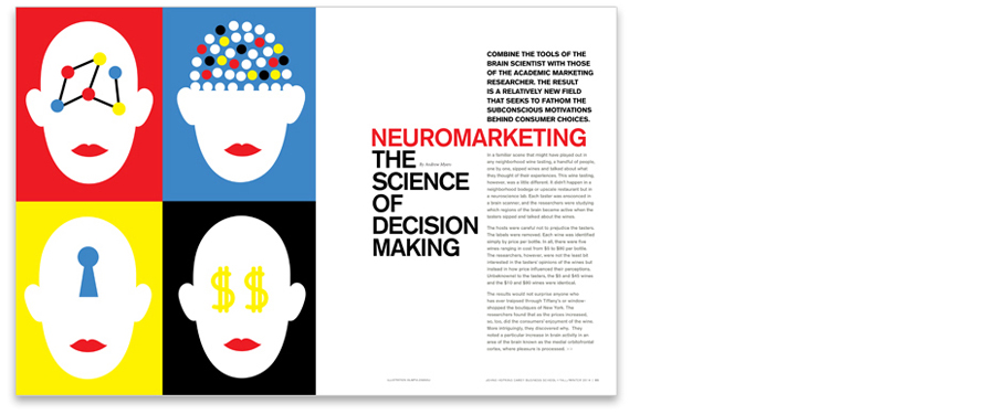
For the Fall 2014 cover on neuromarketing, we wanted an image that represents how consumer’s brains are wired to make decisions. We knew Olimpia Zagnoli’s work from the editorial pages of the New York Times and felt she could visualize this idea perfectly. An illustrator in demand, she happened to be en route to Italy as our deadline approached. She made sketches in a journal and sent us images via her iPhone. Knowing the style of her finished pieces, we were able to make the mental leap from very rough sketches to final art and gave her a green light to proceed. The resulting cover exceeded our expectations and happened to come out just before the Christmas holidays – an added bonus given the festive, colorful quality of the illustrations.
We were able to make the mental leap from very rough sketches to final art… The resulting cover exceeded our expectations.

Olimpia Zagnoli’s sketches for the Fall 2014 cover and inside spread (above), and final art for the interior spread (below).
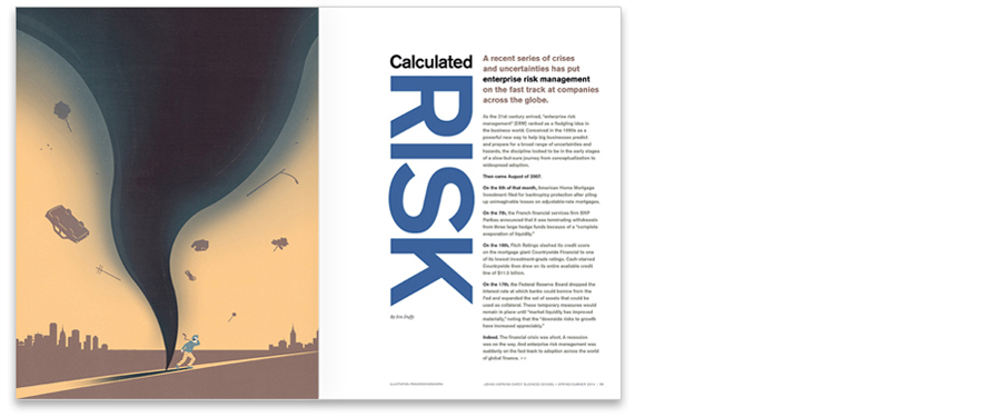
Finding the right visual metaphor – one that distills the overriding concept of a story to an innovative, thoughtful image – makes every cover a creative challenge. Identifying illustrators who are adept at conceiving and rendering great editorial imagery is an important first step. Collaboration and trust between editor, art director and illustrator is also key. For a cover story on the field of enterprise risk management – a hot topic currently in international business and an increasingly popular course in business schools – we explored several possible options for an illustration concept. Before settling on the final image of a businessman navigating through a huge tsunami wave, we looked at sketches in which risk was imagined as a sea monster, a crocodile, arrows, briars, trapeze artists, and tornadoes. When the choice came down to tsunami vs. tornado, the final decision was an aesthetic one. The tsunami was the most eye-catching and cover-worthy of the two images.
Finding the right visual metaphor – one that distills the overriding concept of a story to an innovative, thoughtful image – makes every cover a creative challenge.

Spring 2014 and Fall 2013 covers. Art by Francesco Bongiorni and Ken Orvidas respectively.
The process of illustrating a cover story about students finding business solutions for problems endemic to emerging nations (Fall 2013) was fairly straightforward. We quickly eliminated generic images of globes and maps in favor of symbols depicting business and agricultural principles coming together to foster profitable growth. The idea was based on a project in Peru in which business students helped local farmers enhance their quality of life.
Inside the magazine, we alternate conceptual illustration with strong photography and a consistent typographic style to extend the cover’s distinctive sensibility throughout the publication. The overall tone of ONE is original and smart, one that continues to resonate with Carey’s intellectual, savvy audience.

Three interior feature spreads (above, top to bottom) on enterprise risk management, financial literacy, and health care in the U.S.
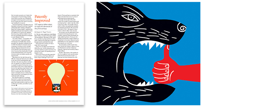
Left: a “Perspectives” piece on changes in the U.S. Patent Office. Art by Sebastien Thibault
Right: illustration by Luba Lukova for an article on crisis management

Illustration on economic incentives to aid the environment by Leigh Guldig
Read other case studies from our Editorial series:
• Magazines: First Impressions
• Magazines: Making Covers Memorable
• Editorial Case Study No.1: St. John’s College, The College Magazine
• Editorial Case Study No.2: New Jersey Institute of Technology, NJIT Magazine
• Editorial Case Study No.3: Messiah College, The Bridge Magazine
• • Editorial Case Study No.5: St. Mary's College of Maryland, Mulberry Tree Magazine
Want to be notified when additional case studies in this series are posted?
Subscribe here to receive emails from us.