
Our primary goal when redesigning Hopkins Medicine magazine was to formalize the underlying template, grids and style sheets for a more contemporary and consistent visual presentation that could easily be maintained by Hopkins staff.

TABLE OF CONTENTS
The magazine opens with a well organized contents page that highlights one of five feature stories with artwork and lists five standing departments. A letter from the editor and feedback from readers runs on the inside front cover.


STANDING DEPARTMENTS
A new 3- and 4-column grid structure was created for departments to give maximum flexibility and organization of content within the template.
Circling the Dome
Consisting of news from around campus, this spread starts with a longer “anchor” story followed by shorter articles of varying length with small supporting spots.
Medical Rounds
A key research story begins the section with commissioned artwork. Other research and clinical news is visualized through custom icons. Clinical “pearls,” a term that is familiar to a physician reading audience, are sprinkled throughout, providing small bits of free standing, clinically relevant information based on experience or observation. The section ends with “Cited,” a page of medical journal research findings.
Media Matters
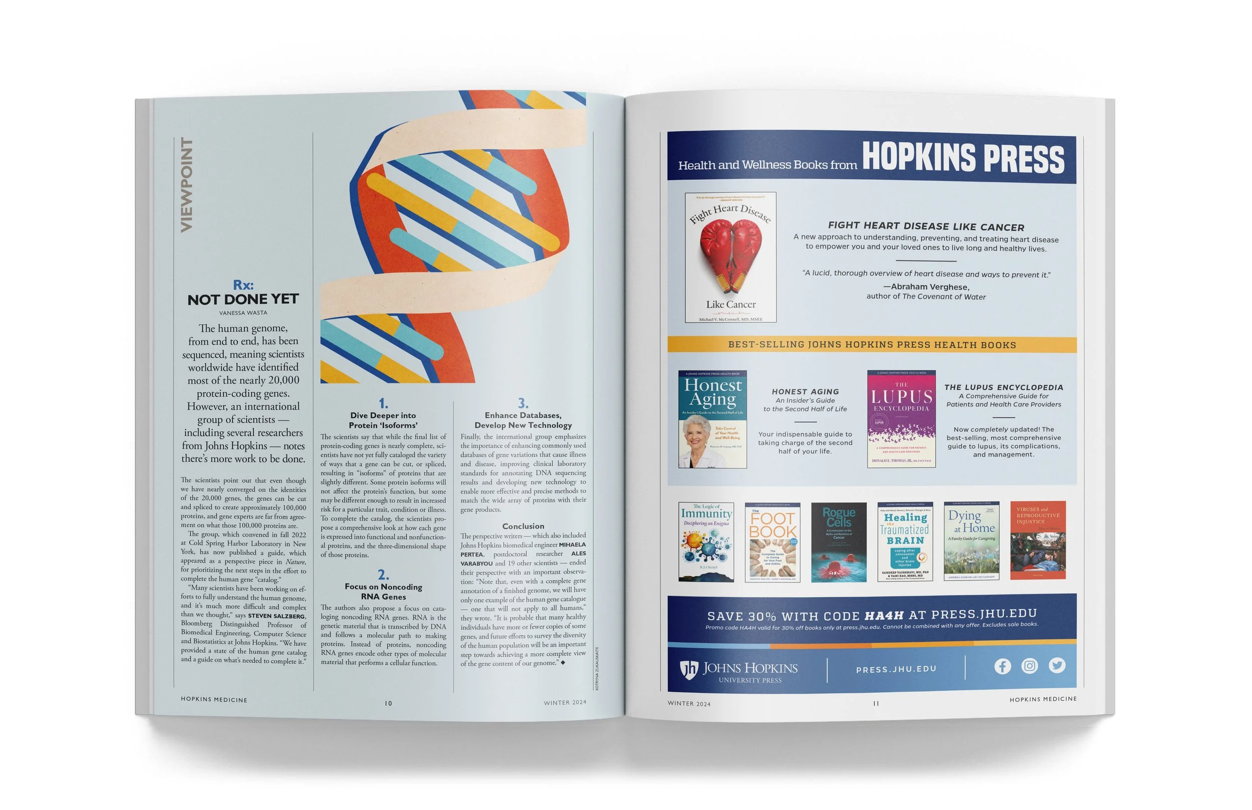
This section is comprised of a narrative book review, “Conversation,” a Q&A with an author or blogger to elaborate on timely or compelling points from their work, and “Viewpoint” a first-person solution – i.e. “Rx” – to a clinical issue.
“Thank you so much for the time, thought and expertise you have put into creating the redesign … It’s exciting to see it come together and I know we are going to really benefit from the visual consistency you are creating.”
— Sue DePasquale, Editor


FEATURES
Our goal with the feature well was to create an inviting readerly experience with impactful opening art followed by “quieter,” more text-driven subsequent spreads with plenty of white space. To achieve this, we employed a variable 5-column grid for maximum flexibility.
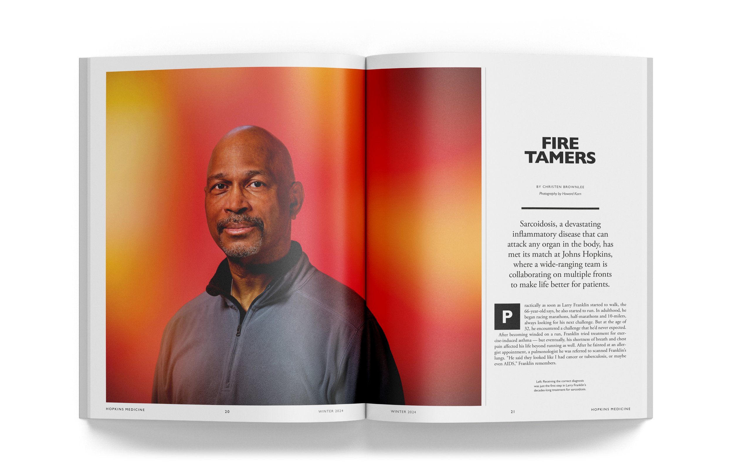
Breakthrough
This 2-page feature serves as a visual break to the longer, more scholarly features and uses a central image to tell the story, with short annotations included for explanation.
Annals
Hopkins Medicine’s most loyal readers have nostalgic memories of their time at JH Medicine — of both people and events. Annals takes a narrative approach and uses archival photos that have a very human focus.
[I reviewed] “the new magazine design and I just wanted to say that I L-O-V-E IT! Thanks for all the hard work and creativity you’ve put into the redesign.”
— Michael Keating, (former) Director of Communications and Design, Johns Hopkins Medicine

